
Bioinformatics Bite #5:
Intro to Graph Interpretation: Bar and Line graphs
Student Edition
OVERVIEW
This worksheet is part of a set of short lessons to help students become familiar with the basics of bar and line
graphs.
KEY CONCEPTS
● Graphs require basic components including axis labels, titles, consistent intervals,
and proper scaling.
● Traditionally, the independent variable is plotted on the x-axis and the dependent
variable is plotted on the y-axis.
● Bar graphs are used when comparing different categorical variables.
● Line graphs are used when trying to examine or establish a trend, particularly when
the x-axis represents time.
OBJECTIVES
● Students will be able to define and identify components of a graph.
● Students will be able to interpret information from bar and line graphs.
● Students will be able to differentiate between the use of a bar graph and a line graph.
__________________________________________________________________________________________
Bioinformatics Bite #5: Intro to Graph Interpretation : Bar and Line graphs
Part 1: What are the essential elements of a graph?
When completing a graph, you are creating a visual representation of data so that it is easier to understand. Some
elements that need to be included in a graph are represented by the acronym “T.A.I.L.S.”
T : Title - Every graph needs to communicate to the audience what the graph as a whole represents.
A : Axes - What does the X axis and Y axis represent on the graph?
I : Intervals - Each axis has to have evenly spaced intervals.
L : Labels - Labels need to be present for each axis and if multiple lines are included, for each line.
S: Scale - The data should be evenly spaced through the image by using a proper scale on each axis.
In most situations, remember that the x-axis will represent the independent variable and the y-axis will represent
the dependent variable.
Why is it important to do this?
______________________________________________________________________________
Part 2: What information is conveyed in a bar or line graph?
Let's look at information from a study published from GLDS-1 (Expression data from Drosophila melanogaster) by
Taylor, et. al. (2014).
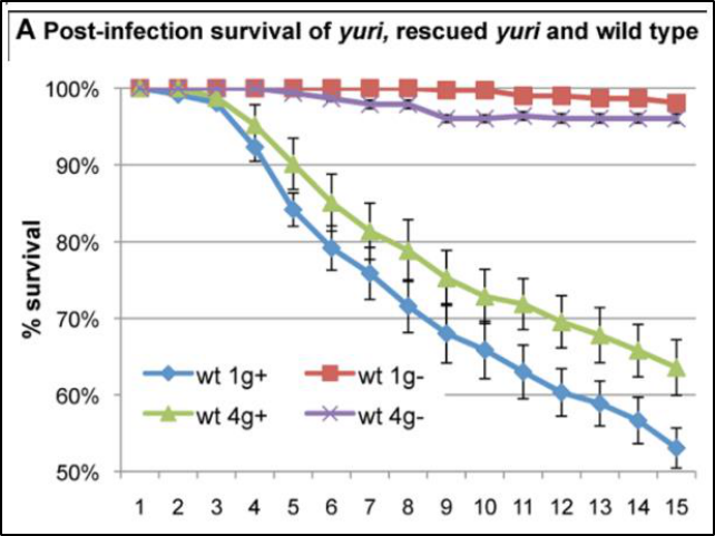
This is an excerpt of figure 1, part A in the study.
What kind of graph is this?
What element is missing in this graph?
The graph compares wild type Drosophila in two different gravitational conditions (1g and 4g) and either infected
with bacteria (+) or not infected with bacteria (-).
Which group has the higher survival rate?
Which group has the lowest survival rate?
What happens to their survival over time? Do you notice anything else in the graph?

Why is this presented in a line graph?
This is an excerpt of figure 1, part C in the study.
What kind of graph is this?
The graph compares stores of carbohydrates in three strains of Drosophila in two different gravitational
conditions (1g and 4g).
Which genotype has the lowest amount of carbohydrate stored?
Do any of the genotypes show a meaningful difference in carbohydrate storage between the two gravity
conditions? How do you know?
Why is this presented in a bar graph?
When should you use a line graph and when should you use a bar graph?
Part 3: When is it best to use a line or a bar graph?
We have learned that there are sets of data or circumstances that are best represented by either a line or a bar
graph.
Opportune uses of a bar graph include:
● Comparing different groups.
● Comparing larger differences over time (for example, population in 2010 vs population in 2020).
Opportune uses of a line graph include:
● Establishing a trend over time.
● Comparing various groups over the same period of time.
● Looking at rates of change.
For the following examples, determine what the better choice of graph would be (line or bar) and explain why.
Situation 1: A student has asked their peers what their favorite school lunch is and wants to report the data.
Situation 2: A class conducted an experiment where they grew two groups of plants, one group was grown in direct
sunlight while the other group was grown in the darkest corner of the classroom. They want to show changes in
growth of each group during the three weeks of their experiment.
Situation 3: Students were asked to log the time they spent doing different activities (homework, eating, sleeping,
video games, etc) for a week. They want to show the results for the entire class in a graph.
.

Part 4: Learning Aims and Evaluation
Please rate where you personally are at, with regards to the learning aims, at the end of the lesson and why.
Rating Scale
1- I do not understand it at all yet.
2-I understand parts of it, but I need my teacher and/or classmates’ support to answer questions.
3-I understand it and can complete an assignment by myself.
4-I understand it so well I can teach others and apply my knowledge to new situations.
Learning Aim #1: Students will be able to define and identify elements of a graph.
My Evaluation of Learning Aim #1 and Explanation:
Learning Aim #2: Students will be able to interpret information from bar and line graphs.
My Evaluation of Learning Aim #2 and Explanation:
Learning Aim #3: Students will be able to differentiate between the use of a bar graph and a line graph.
My Evaluation of Learning Aim #3 and Explanation:

NGSS Standards
MS-ETS1-3 Engineering Design
Analyze data from tests to determine similarities and differences among several design solutions to identify the
best characteristics of each that can be combined into a new solution to better meet the criteria for success.
REFERENCES
GLDS-1 Publication: Toll Mediated Infection Response Is Altered by Gravity and Spaceflight in
Drosophila
Authors: Taylor Katherine, Kleinhesselink Kurt, George Michael D., Morgan Rachel, Smallwood Tangi,
Hammonds Ann S., Fuller Patrick M., Saelao Perot, Alley Jeff, Gibbs Allen G., Hoshizaki Deborah K.,
von Kalm Laurence, Fuller Charles A., Beckingham Kathleen M., Kimbrell Deborah A.
PubMed ID: 24475130 DOI: 10.1371/journal.pone.0086485
AUTHOR
Scott Ryan, Passaic Academy for Science and Engineering (Passaic, NJ)
Edited by GL4HS Staff
